Enquiry has been submitted
Overview
Each column of a query result row is displayed on its own line in the panel.
Column titles are converted to a natural display form by replacing - and _ with space and capitalizing each separate
word of the title.
Multiple rows are displayed grouped by column title.
When using multiple queries or connections they appear in their own section on a panel.
Panel sections
Extra formatting options are available for query results to build a rich page of information. Panels are meant to be
called from a report using the pass_reports feature. They do not have interactive report fields.
When a report passes in parameters the report field must be defined, but it won’t be displayed. If you want a field
value to be displayed then create a panel section to show it.
NOTE: Headings are only displayed when more than one section is in the panel.
Multiple panel section can be used. Each panel section body will create a separate named section in the panel.
Example
- name:
Text only heading - format:
panel - SQL:
Select 'Hello I am a Panel' as title
Field values passed from the calling report can be replaced using the {variable_name} jinja2 variable substitution.
SQL statements in panels are run for each active database connection. Each column of a query is pivoted and displayed on a separate row for it’s corresponding section.
Panels are called by use of the pass columns and pass report definitions of a result report.

Panel formatting options
Panel title formatting
The title of the panel is the name of the panel
Format of result
Various formats can be used for each panel.
| Option | Description |
|---|---|
| panel | Default. A panel composed of a line for each column of the query |
| html | HTML formatted panel body. Include any HTML tags and formatting into the SQL body |
| result | A table of results from the SQL query |
| line | Line chart with joined dots |
| bar | Vertical bar chart |
| doughnut | Pie chart with a hole in the middle |
| pie | Pie chart |
Column formatting
When using the panel formatting option these special values can be used
to apply enhanced appearance to each line item.
| Column value | Column name | Description |
|---|---|---|
starts with http: or https: |
any | The value becomes a hyperlink |
starts with iframe: |
any | The rest of the value is an iframe url |
| any | starts with collapsed: |
Any subsequent columns / values are collapsed (up to the next collapsed) and can be expanded by clicking + |
starts with img: |
any | The rest of the row value becomes an img html item with the value being the image location |
| any | any | If text is complex JSON, will be formatted as code and syntax highlighted |
starts with ** |
any | Only show the column name, hide the value |
| any | starts with ** |
Only show the value, hide the column name |
Example panel definitions
| Name | body |
|---|---|
| Example Panel | select phonemobile, contactfirstname, contactlastname from job_contact where contactid=:field_value_1 |
| SQL with hidden column name using ** | select 'hello' as "**Greeting" |
| Direct text using ** | **This is verbatim |
| Hyperlink using https | https://google.com; |
| Collapsed section using collapsed | select 'Example' as "collapsed:example" |
| Image example using img | select 'img:https://picsum.photos/100/100' as "Image" |
Pass Reports
This section allows configuration of connections to other reports and panels. Add an entry
for the panel column and the report to go to. Click on the Add button to create a connection. Any
number of connections are allowed.
Panel sections with the format result or panel allow a connection to
another panel
For example, to create a connection from a query heading email to report user details where email
is field_value_1 in the report user details:
- Panel Body Column Name:
email - Report:
user details
When there is an active connection a clickable hyperlink will be enabled in the panel section for the value and column that matches the connection configuration.
NOTES:
- Only the first field value (
field_value_1) is sent to the pass report. - Report names are case-insensitive.
- Columns names are case-sensitive.
- Column names may appear different in a panel due to the natural display feature. Use the column name from the SQL query.
Charts
Simple charts using, line, bar or pie formats can be generated from a section SQL result.
Chart Types
| Option | Description |
|---|---|
| line | Line chart with joined dots |
| bar | Vertical bar chart |
| doughnut | Pie chart with a hole in the middle |
| pie | Pie chart |
Chart values
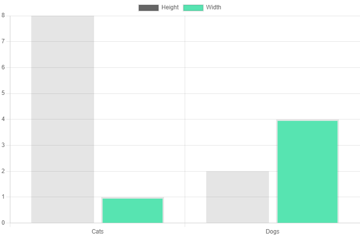
The first column will be the labels, and subsequent columns will be the bar or pie data values.
Only data columns composed of numeric values will be included in any chart.
Example:
Select 'Dogs' as "Label", 2 "Height", 4 "Width"
union
select 'Cats', 8, 1
Can be used to create a bar graph with two columns labeled Dogs and Cats.
Bar and line colors are automatically generated.
